Mr Hyde
27 Mar 2022I’ve had this site running on GitHub pages for about 6 years now, and thought it was about time for a bit of a facelift. The previous design, based on the Mediator theme, was starting to feel a bit heavy and over-complicated.

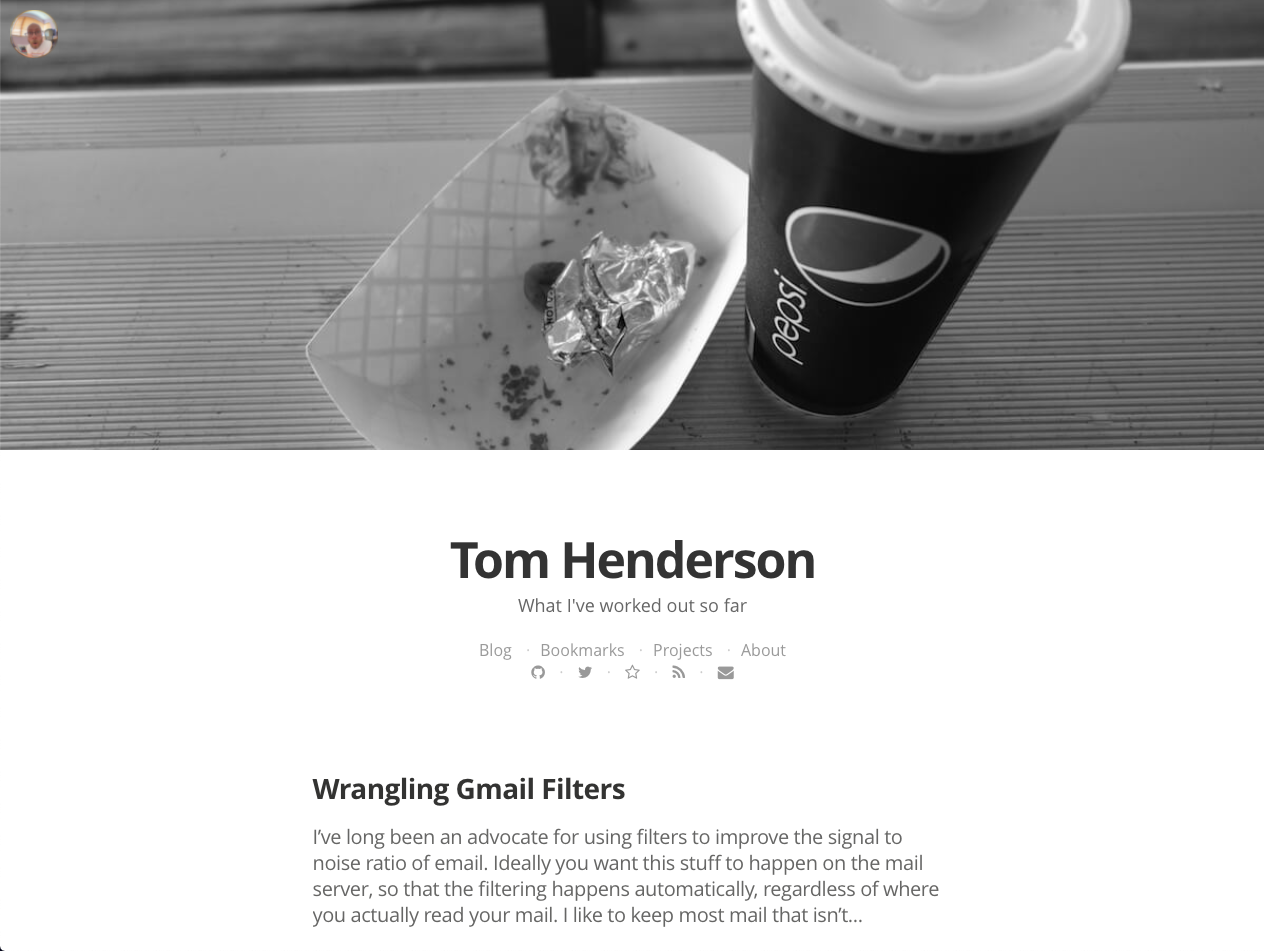
The html was a big mess of divs with dozens of classes and whenever I wanted to make a change I found it just too much effort to figure out which classes needed changing or which include or template was involved. I’m also a bit over the trend of massive header images, even though I did enjoy picking out the images when I used them. I had also reached the point where I didn’t really want my site to look like Medium any more.

Another goal in the refresh was to drop as much of the bloat as possible. I’m still using Disqus for comments, which means I’m still loading a bunch of social sharing garbage on every page load, but at some point I’d like to swap that out for something more simple, possibly something running on lambda / dynamodb. For now Disqus will have to do, although I’m also considering just removing comments altogether.
Maybe one day I’ll build a theme from scratch, but for now the Hyde theme seems to have everything I need for a personal site. The only significant changes I made were an archive page with a list of all posts, a tweak to the top menu at mobile sizes, renamed related posts to recent (since that’s what they are in GitHub pages), and found a nice blue for the sidebar that I really like.
